Last year, U.K. startup Nothing released a really swanky looking smartphone that American customers unfortunately couldn’t get their hands on. Things are different this time around.
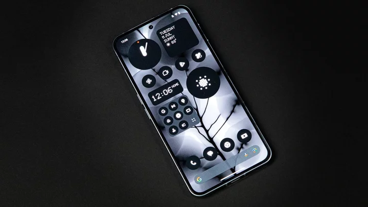
Meet Nothing Phone (2), the second flagship phone from Carl Pei’s (formerly of OnePlus) trendy company. It marries the futuristic-yet-nostalgic transparent glass aesthetics from other Nothing products (like the Ear (1) earbuds) with upgraded specs over last year’s model. A couple of minor visual changes with the signature LED glyph board on the phone’s back add to an overall theme of trying to make you look at your phone less.
Good news/bad news time: The bad news is it’s hard to take your eyes off the Nothing Phone (2) while using it, kind of destroying its stated purpose. The good news, however, is that you want to keep looking at it because it’s a quality Android phone at a very agreeable $600 starting price.
Moreover, it’s just nice that there’s another solid alternative to the typical Google and Samsung options for Android lovers.
SEE ALSO: Google Pixel Fold is a quality first swing at a foldableThese specs aren’t Nothing
Credit: Molly Flores/MashableTo start, here’s what you get for the $600 starting price (which naturally goes up to $800 with the most RAM and storage space):
6.7-inch OLED display with 120Hz adaptive refresh rate
Qualcomm Snapdragon 8+ Gen 1
8GB or 12GB RAM
128 to 512GB memory
Face and finger unlock
4,700mAh battery
Two 50MP lenses on back
32MP front camera
The main thing you’ll notice about Phone (2) right away is that it feels premium despite a high-mid-range price. Its display is huge with 1,000 nits of peak brightness and a 2412x1080 resolution that keeps things looking sharp enough. I’m on the record as not being a huge fan of phones of this size, as it requires two-handed use much of the time, but at least Phone (2) is very light and breezy to hold.
Visually, Phone (2) treads the same path as Phone (1), with a transparent glass back that showcases a “Glyph” pattern of LEDs that serve various purposes. More on that in a bit. This year’s Glyph pattern is slightly different, with more individual LED strips making up a similar pattern. Still, though, if you saw last year’s phone, you’ve pretty much seen this one. If you didn’t, congratulations! It’s pretty cool.
Other bits and bobs include a power button on the right side and a volume rocker on the left. A USB-C port for charging graces the phone’s bottom, while an in-display fingerprint reader is used for biometric unlocking by default. There’s also a face unlock option if you prefer that, but the fingerprint reader worked perfectly fine for me.
Glyph glam
The Glyph looks rad, at least. Credit: Molly Flores/MashableObviously, the main point of interest with Phone (2) is the Glyph interface. It’s the one thing Nothing offers that you can’t get on any other phones that I know of, and at least in theory, it’s kind of cool.
The basic idea is that you’re supposed to set the Phone (2) face down and let the Glyph lights tell you what’s going on. This can range from notification lights that shine until you open said notification to a physical, light-based progress bar for your Uber ride (I didn’t get to try this one). There’s a “Glyph Composer” that even lets you create custom ringtone light shows.
Combine that with Nothing OS 2.0’s (which is really just a fancy version of Android) new features and general vibe and you’ve got a phone that’s somewhat oddly designed so you don’t look at it very much. The new OS brings an optional monochromatic look so individual app icons look less shiny and enticing, as well as a bountiful display of widget options for both your home screens and lock screen.
There's even Glyph lights around the cameras. Credit: Molly Flores/MashableIn other words, you’re supposed to use the Glyph lights as beacons while the screen is lying face down. In more active phone use scenarios, you’re supposed to be quick and intentional with what you do, rather than lazily scrolling between every app you have.
This…didn’t really work for me, but I’d hesitate to criticize Phone (2) on those grounds. I’ve been using smartphones a certain way for more than a decade now, and one week with a phone that tries to do things a little differently won’t change the wiring in my brain. I commend Nothing for trying something.
That said, it’s not a perfect effort. Light show ringtones and notifications are nice, but ultimately, I’d rather have my phone face up at all times so I can actually, you know, see the notifications or who is calling me at a glance. Leaving the phone face down adds an extra bit of effort to that process, while leaving it face up means you’ll hardly ever see the Glyph lights to begin with.
In all, the whole Glyph interface and its knock-on effects with the phone’s UI design feel more like gimmicks than transformative new features. But the good news is you can totally ignore all of that.
Chasing the Snapdragon
The real reason to get Phone (2) over Phone (1), aside from the fact that it’s now available in the U.S., is that its performance profile should be much improved.
That’s because the old Snapdragon 778G+ chipset has been replaced by the newer (but still not quite top-of-the-line) Snapdragon 8+ Gen 1 chipset. Without getting too into the weeds, that basically means the Phone (2) runs faster than its predecessor. Apps load very quickly, nothing hitches up or slows down in a way that’s noticeable, and, generally speaking, it’s as slick to use as other recent Android handsets like the Pixel 7 Pro.
The real jewel of the performance side of things is the 4,700mAh battery, though. This sucker can run on a full charge for at least 24 hours. Can’t complain about that.
Good camera, but not good enough
If there is a “weak link” to the Phone (2), it would be the camera. To be clear, this mobile array featuring two 50MP rear lenses is perfectly adept at taking handsome smartphone pictures. It’s just not quite as good as other, similarly priced Android phones.
Still, I’ll show you what it can do first. Photos taken on Phone (2) come out vibrant and colorful, almost looking hyperreal compared to what your eyes actually see at times. This graffiti certainly looked nice in person, but on Phone (2), it really popped.
Magic. Credit: Alex Perry/MashablePortrait mode also adds a nice bokeh effect to your subjects, and can work with smaller objects like this plant without much trouble.
Portrait mode works. Credit: Alex Perry/MashableThis isn’t an impressive photo, per se, but I like to show off this Pokémon art in my neighborhood as often as I can.
My friends are here. Credit: Alex Perry/MashableAs far as “problems” with the Phone (2) camera go, I wasn’t super impressed with its nighttime photography software. Maybe it was a product of the environment (nighttime shots can be tricky on any phone), but the closest thing to a pronounced effect I was able to create came with these two photos, which don’t look all that different at a glance.
No night mode. Credit: Alex Perry/Mashable Night mode. Credit: Alex Perry/MashableThe zoom lens is also fine relative to what phone cameras have offered for the last several years, but it sadly can’t compete with Google’s 30x zoom on Pixel 7 Pro. Phone (2) only goes up to 10x, and results at those zoom levels are blurry and not real useful.
Yeah, could be better. Credit: Alex Perry/MashableThat said, lower zoom levels still produce clear shots. This was taken at 6x zoom.
That's better. Credit: Alex Perry/MashableLike I said, the Phone (2) can create great-looking shots for your social feeds. It’s just not the Pixel 7 Pro or even the Pixel 7a, which benefits from Google’s software features like Photo Unblur and Magic Eraser.
It’s no Pixel, but at least it’s got its own vibe
The way I feel about Nothing Phone (2) is the way I feel about most Android phones: You likely won’t be disappointed if you buy one, but I’d still recommend a Pixel over it.
Nothing’s unique approach to UI design is worth commendation, to be sure, even if it didn’t produce its intended effect on me during my time with the phone. It’s admirable to want people to be more careful with their phone use. And even if you choose to ignore that side of Phone (2), you’re left with a fast, slick Android phone that almost certainly looks cooler than anything your friends have.
Nothing’s second attempt at smartphone glory isn’t a total slam dunk, but it at least belongs in the highlight reel.


