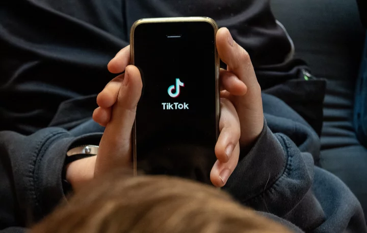
Move over Comic Sans, there's a new clown in town: TikTok Sans.
Today (May 17) TikTok officially unveiled its very own font, TikTok Sans. Many users have already experienced the switch from the old font over to TikTok Sans. As is typical with any design update to a social media platform, users are outraged. The subtle change is enough to make any frequent TikTok user feel like they've lost their mind. The new font is longer and suspiciously looks like the font that's a dead giveaway that someone uploaded a video from an Android.
SEE ALSO: TikTok finally lets creators cash in on their viral effectsAccording to a press statement, Grilli Type specially designed the font for TikTok, so it's safe to assume some serious cash was invested in creating the font to deceive your eyeballs. The platform aims "to improve the user experience by optimizing legibility and reading retention, along with providing multi-language font support for our global community." (So far, the new font has decreased my reading retention. I can't click out of the app fast enough.)
The press statement documents the changes from the previous font: TikTok Sans letters have "bigger openings and clearer strokes" and "slicker and simpler shapes." The font is also "visually larger and overall line height has been increased to improve readability." It currently supports English, Spanish, Portuguese, French, German, Italian, Indonesian, Turkish, and Vietnamese, with plans to expand it further.
Disgruntled users have taken to Twitter to complain about the change. One writes, "the slight font change on TikTok is making me want to rip my own teeth out with my bare hands." Another says, "ew what is that new TikTok font." Others are "breaking their silence" to reveal they actually like it.
The outrage will surely blow over when the craving for bite-sized content outweighs the optical irritation, our eyes will eventually adjust to the change.


