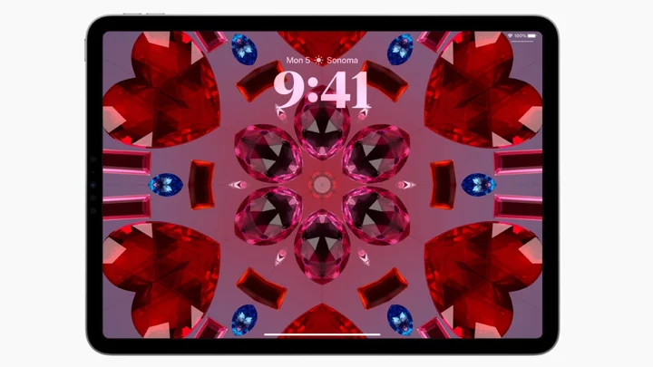
The iPad, for all its glorious, hi-res screen estate, can sometimes feel quite barren. Its Lock Screen, for example, never really offered a lot in terms of customization or personalization; even the wallpaper choices were mediocre at best. With iPadOS 17, however, this changes in several important ways.
First, you can now add widgets to the Lock Screen; besides giving you a bunch of information at a glance, you can also tap on these widgets to activate the underlying app.
SEE ALSO: Apple ID supports passkeys on iOS 17, iPad OS 17, and macOS Sonoma. Here's how to test it out.Also, Live Activities now also show on the lock screen, giving you a quick overview of your incoming Wolt delivery or the score of a baseball game.
Finally, Apple now offers several new dynamic wallpapers, some of which are really stunning to look at.
We've tried all this out on a developer beta of iPadOS 17; these are our impressions.
Like a space video game
By far my favorite new feature on iPadOS 17 are the new Astronomy wallpapers. These are dynamic, animated wallpapers which let you choose one of eight planets in the Solar System (no, Pluto is sadly not included), as well as the moon, and a depiction of the entire Solar System itself.
Credit: AppleYes, we've seen something similar on the Apple Watch, but it pales in comparison with how the wallpapers look on the iPad's large display. (I have at my disposal the latest 12.9-inch iPad Pro.) It's like looking at incredibly detailed graphics of a video game, and if you create a pair of wallpapers (one for the Lock Screen and another for the Home Screen), you'll get a cool animation when you transition from one to the other. I only wish I could rotate Jupiter on my iPad's display, or zoom in with a flick of my fingers (I haven't found a way to do that, unfortunately).
You can also use a photo or a set of photos as wallpaper, and there's a new Kaleidoscope wallpaper that comes in several colors and it animates when you switch your iPad from landscape to portrait more and vice versa.
Finally, while in editing mode, you can customize the font style, weight and color of the date and time indicator on the Lock Screen; tap on it, and choose the options you like best.
Widgets, so many widgets
Credit: AppleThe iPad's Lock Screen can now feature widgets, giving you a glance at your calendar, clock, battery status for various devices, and more.
The widgets are interactive; you can touch them to launch the corresponding app. Third-party widgets are also available; for example, I've set up a Tessie widget that displays the battery charge state of my car.
Widgets on the Home Screen have also gotten better; for example, the Podcasts widget now lets you play or pause an episode with a tap, Music lets you play or pause a song, and the Home widget lets you access the controls you've set up. You can do all of this on the widgets themselves — no need to open the actual apps. There's also more freedom as to how you can organize your widgets, which can now be placed anywhere on the Home Screen, even if it means leaving some blank space in between.
This last bit is actually really useful: I like to leave key bits of my wallpaper visible, so I've set up a couple of different screens (one for calendar and weather, and one for reading and entertainment) with my widgets positioned in a way that lets the wallpaper breathe.
Live Activities on the iPad? We have those
Credit: AppleWaiting for a food delivery, an Uber, or setting a timer for that perfectly baked pizza? In iPadOS 17, you can see how those are going on the lock screen. Live Activities work mostly the same as they do on the iPhone: They show up when something's going on in the background, and disappear when it's done. You can control them or tap them to get more info about a particular activity. Multiple timers are supported, and third-party developers can join the party too and build Live Activities for their apps.
Now Playing, which displays the music or podcast that's currently playing, has also been redesigned, and it now features a nice, large image of the accompanying album art.
Finally, notifications that appear on the lock screen have also been slightly redesigned, with bolder text and bigger images. You can swipe left or right to change the way notifications show up; the options on offer are stacked view, count view, and expanded list view.


