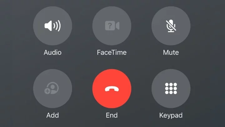
Well, that was fast. After moving the 'end call' button in an iOS 17 beta to the right side of the screen, angering many users who are used to it being in the middle, Apple has apparently changed its mind.
In the latest public iOS 17 beta, the 'end call' button is once again positioned in the middle, albeit it is now nested within the other buttons instead of being separated and located lower as it was in iOS 16. Check out the difference below.
On the left: New end call button positioning. On the right: The (short-lived) old positioning. Credit: Stan Schroeder/Mashable/AppleIt may seem like a small change, but with hundreds of millions of users relying on muscle memory to hit that end call button every day, it's probably for the best that Apple decided to place the button back in the middle.
As X (sigh) user @M1Astra noticed, the end call button is still positioned on the right when the keypad is displayed.
SEE ALSO: Apple to send out settlement payment to iPhone users soonThis change is only available to users who have opted to install public iOS beta versions. The final version of iOS 17 will likely become available in September, coinciding with the launch of Apple's upcoming iPhone 15.


