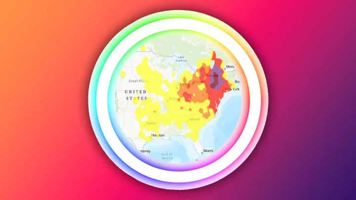
Eastern Canada’s current wildfires are causing serious air quality issues across large swathes of the U.S. This interactive map from AirNow will show you exactly where.
Various local, state, and federal agencies report all their air quality data to AirNow, which uses it to create tools where you can find out everything you need to know about the air you’re breathing. The map is one of them. Its color-coded system is based on the Air Quality Index (AQI), which assigns a score to an area according to its pollution levels. Anything in the zero to 50 range is green, followed by—in increments of 50 or 100—yellow, orange, red, purple, and maroon.
A yellow or orange AQI designation may mainly pose health risks to people with preexisting respiratory or heart conditions, as well as kids and older people. Once you get into the red, the general public could start to experience breathing issues. Here are some ways to stay safe when the air quality is poor.
Type in your city or address in the search bar above the map to see the AQI where you are. You can even choose to show the AQI based on specific pollutants: ozone, PM 2.5 (the type of particulate matter created by wildfires), or both. You can also see the forecast for tomorrow’s air quality, a time-lapse of how the air quality has changed in the last 24 hours, and an archive of previous air quality maps.
It’s a handy method of tracking how a weather event has impacted air quality across the continent—and finding out how the air wherever you are measures up against the air in the surrounding region.
Explore the map here. And for more data on your area’s air quality, you can download the AirNow app.
This article was originally published on www.mentalfloss.com as AirNow’s Interactive Map Shows You the Air Quality Index in Your Area.


